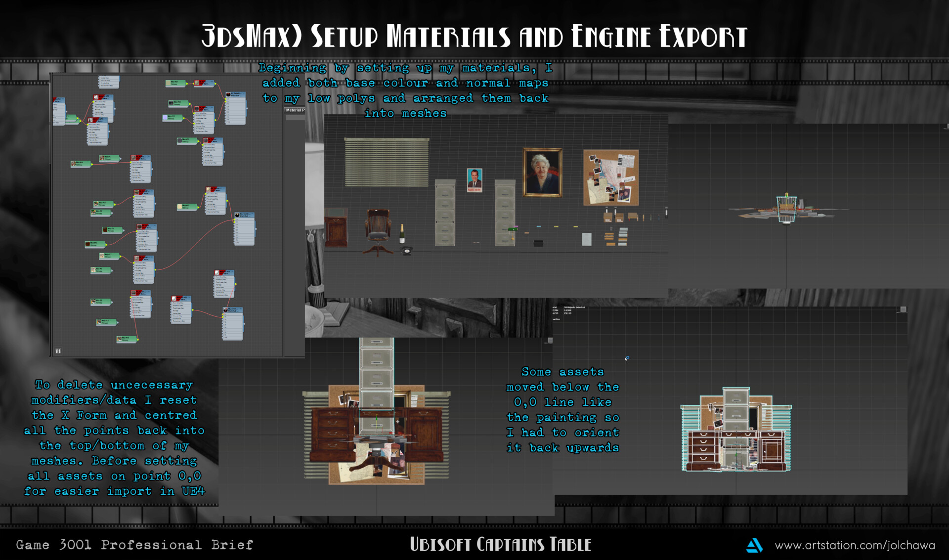
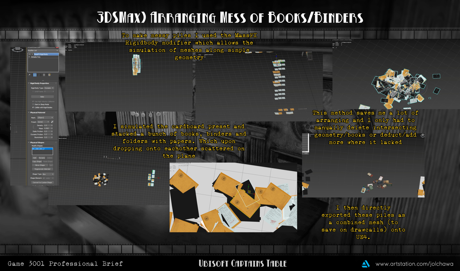
Full Title: Game 3001 Professional Brief 2 ) Captains Table Environment - Decals and Animation (Week 8) (21/11/2022)
Working on Feedback - Decals and Polishing)
Following my feedback the other day I decided to work on quite a lot of polishing towards my textures. I added more decals towards the environment, focusing on capturing the dirt and mess of Columbo’s footsteps. Following having to track through the woodlands to find Ken Franklin's cabin in the episode. I would imagine Columbo would not be the type of character to have time to settle down and wipe his boots but rather add more evidence to ponder over his desk. Furthermore consdering the smoking age of the era I added wall damage to the paint as I would imagine both yellowing and peeling with cracks concurring on the poor paintjob over countless cigar filled days filling the room as Columbo tries to figure out the murderer. I also wore down the chair by scraping more lighter values of a leather texture on top and applying a similar fill mask to my roughness channel. Before reporting the new maps back into UE4.
Decals - Creating Alphas and Streamlining Master Materials)
As previously mentioned I had added numerous decals to my scene to help captivate more detail and unique flair to my tiling materials. However previously I had constructed decals using only Substance Designer and Photoshop for alpha and detail work. Which felt very inorganic in shape and form alongside design being seamless. So I instead opted to export out a plane, of which was unwrapped completely flat filling the space. This plane would act as a base for accessing the numerous fill and paint tools Substance Painter has to utilise. Furthermore I used fill masks with alphas of footsteps, dirt brush piles and cracks to simulate the necessary colour/roughness/normal maps I would need. To help streamline this, I used a variety of folders as well to wipe the opacity slate clean for adding more decals. Back in the engine I set up a master material with parameter texture assets to simply drag and drop instances of my finished and exported decals to the slots. As previously I had used the tiling method with a texture set instance that would crop/mask out the areas unused by other decals. In retrospect I believed this would be saving on cost as only one large texture map would be required. However the nodes required to crop and process out the unnecessary features alongside the fact it was also material instances at the end of the day meant I could have streamlined/simplified this a lot quicker by having unique maps. With detrimentally no big performance changes.
Setting up Glass Shader)
Throughout the days I have spent countless hours fine tuning and coaxing different methods of shading my cigar tray. My primary and first attempt at a glass shader much like the window pane glass was simple, translucent and had a refractive value just enough to distort its underside. However for my ashtray I needed dirt, grime and haze from the cigars to come through. And went back to reincorporate a technique that blends worldspace coordinates of different faces to apply a dirt texture smoothly, similarly akin to a triplanar fill method in Substance Painter. However with the refractive properties of the glass I could not isolate the areas of dirt and would see them from angles suffer from the same distorted effect. This is not realistic unfortunately and as such I went through lots of different tuning of values and iterations. Finally settling on an overall more opaque ashtray, with minimal refractive properties and isolating roughness/opacity values for the dirt colour to come stronger through. Furthermore adding a decal below to apply a firm dirt spot for the cigar bits.
Creating Light - Office Light Fixture)
One stretch goal I was happy to incorporate and fit in was the office fan light fixture. As suggested by my peers the room had no realistic means of being that bright from the front on perspective and as such I took this further to add a fan light. Typical of offices of the time and modern in either home or precinct. I also wanted to have the ability to add simple animation and by simply modelling the blades separately I knew I could realistically accomplish this stretch goal. So I went on to utilise reference pictures to model a low poly variant of the fans with square boxes as base meshes. Extruding the sides out and adding additional swift loops to round off the edges. I knew I only had to model the centre plane and a single blade as their position would be fairly dark so a repetitive fan blade shouldn't be too noticeable.
Additionally I wanted to minimise how much space would be used up on another texture sheet since this would act as its own unique asset. Following simple turbosmooth on my finished asset, rounding of edges and applying vertex paint as demonstrated before. I was quickly able to export it to Substance Painter for baking and texturing. Not too much detail was basked here as the meshes were relatively similar but I knew I needed many maps to help apply further masking such as edge damage and wear through a fill editor. I would then paint the colour differences and smooth out any extra detailing through masks that would stick towards vertex paint. I was easily able to also colour drop opacity onto my small pulley chains that would control the light and spin of the fan. Another key map detail I added was that of the emissive channel. Through this map I was able to control the glow that typical office fans have. However with Columbos fan I wanted to really push the dirt, damage and beating this poor fan would have suffered being the highest vantage point for cigar smoke to affect. As such the outer ring does not glow and the primary point of light is on the edge of the cone. Due to smoke dwelling upwards and making its way to rest any tar/residue on the outer ring rather than centre of the bulb.
Animation - Telephone, Light Fixture and Typewriter)
With primary meshes such as the typewriter being high in detail and structure I knew that I could easily purpose animation into my work. By animating assets I really wanted the scene to become believable and realistic as almost as such Columbo was just stepping away for one more thing. So I went on to purposely go through many hurdles to understand the process of animating props. My prior knowledge, application and understanding was that animation needed bones and rigging. And so for my fan blades and telephone I added 2 or 3 bones to simulate an anchor point, and the moving bone. This worked out swimmingly, as keyframe bones were easy and I could even deform that of the telephone line lightly as the phone rang. However this was also wholly unnecessary as weight painting, bones and more are only good for deforming meshes and I want to create around 7 for my typewriter.
These bones however had to be unique and couldn't work off of one single root bone (foreshadowing incoming) since a root bone would limit the upwards and downwards motion. So I rigged them and animated my typewriter according to 3 different anchors. I thought the animation worked well and as I split it into different bones it should be easy to gather and import into the engine. How wrong I was. Unreal Engine refuses to use rigs and animation sets off of multiple anchors/root bones. So I was left with either scrapping my animation, rig and work altogether to manually animate the changes of the keys/paper scraping. Or go through the maddening process of exporting the typewriter into 3 key meshes, the moving keys, backwards moving cylinder/paper and the unmoving body.
Then assemble this mesh on the same point in a blueprint as to keep them together and maintain correlation in syncing the animations on the same point in time. I went for the latter, primarily out of stubbornness and also not wanting to lose my work with reanimating the assets as the rig worked well. Performance wise I am wholly unsure if splitting it into so many meshes but combining in blueprinting has a terrible impact on culling/draw calls. But I am certain that I have learnt my lesson when rigging static objects.
VFX - Smoke and Dust)
I had a lot of fun repolishing a smoke VFX I had been working on and including in a lot of my projects. The plumes unfortunately suffered some visual errors as the materials were not only emissive in a strange manner but opacity had been set incorrectly. As such the lighting would, regardless of set particle colour, apply a dark mask of black. Rendering the smoke invisible. After fixing this matter I went on to add a little bit of dust particles to the scene. Fortunately I was able to repurpose a firefly cascade shader to do exactly this. However needed to really finetune the values to once again no longer be emissive, move way more erratically and drastically fade out of view. What was a simple task, unfortunately yielded some problems as I initially wanted the particles of dust to rotate but could not find a means to tile thai appropriately to another point, such making the centre the pivot. Meaning the plane would spin but visually not change as it's a sphere. I ended up culling this idea altogether and went on to fine tune the amount spawning in the scene. Unfortunately and much like real dust there is always way more in the scene than what is seen through the camera. However with lifetime expectancy set low I didn't experience any major effects of frame rate and can happily showcase the full diorama still capping at 70-80~ fps with all animations, VFX and mid poly meshes considered.
Weekly Evaluation and Fixes)
This week was a big one, as not only was I having to import my fina meshes, textures and more. But setting up a large array of decals, VFX and animation to boot added a lot of stress to my workload. However I also made a lot of mistakes which taught me a ton of working with this wide array of assets. The main takeaway being is, consider how meshes are utilised and if animation is a core piece of the process. A lot of my cutaway optimizations such as the inner of the typewriter rendered some animations fairly risky. As my inexperience with the technology made me model it without cutting further in which would definitely been necessary as the backside moves in. Luckily the lighting removes seeing any missing texture and the animation also quickly manoeuvres back to position. However, if I had spent more time on the research rather than assumption from watching a few clips of Columbo, I knew I could have been truer to life. Additionally my blockout stage in comparison is highly saturated and values are all over the place. I uncovered a key piece of composition and value control in this project, greyscale LUTS and cinematic viewports. By using grayscale LUTSI destaurated all of my scene and was able to make elements of disinterest darker, moving that of importance/highlight to eb lighter. I could then also desaturate my base colours by a small percentile as that is an issue I struggle with now looking back on all my projects. Furthermore the cinematic viewport allows the viewing of the scene with a 3,3 grid. Having been reminded and taught of the rule of thirds but with no way of easily applying said tools without overlay in photoshop, I ended up scrapping half of my camera setup in greyboxing for better angles. Next week I can't wait to get out my renders, and talk more upon the subject.